Lorem ipsum dolor sit amet, consectetuer adipiscing elit. Cras id est. Proin rutrum, elit et consequat convallis, lectus lorem laoreet nibh, in accumsan quam odio mollis massa. Vestibulum ullamcorper lectus eget tellus. Morbi dictum, libero sit amet adipiscing facilisis, ipsum nibh lobortis tellus, id sodales tellus augue at mauris.
Quisque sit amet nisi. Maecenas pretium gravida turpis. Sed rutrum cursus lectus. Aenean commodo magna eu nibh. Vestibulum ante ipsum primis in faucibus orci luctus et ultrices posuere cubilia Curae; In hac habitasse platea dictumst. Suspendisse potenti. Proin sit amet libero. Phasellus quis augue vel orci egestas nonummy.
Curabitur ac eros in mi vestibulum ornare. Lorem ipsum dolor sit amet, consectetuer adipiscing elit. In hac habitasse platea dictumst. Ut augue leo, dignissim ut, convallis nec, consectetuer in, arcu.
relax... here's the link for generating the 'Lorem Ipsum' random text.
www.lipsum.com
Thursday, November 29, 2007
Thursday, November 15, 2007
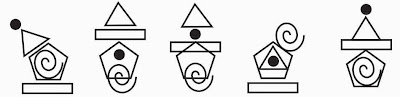
An interesting icon design...
I happen to review my design which I did for an EPM portal in a CMS tool called Joomla - an open source content management tool. I noticed an interesting icon design in that application...
Generally I prefer to buy icons online from sites like stockicons.com (I'm loving it :). They have invested good amount of time, effort and creativity in getting the icons right. It gives all the finesse you will need to make your application look world class...
Most of the icon visuals are abstract of what was in practise before computers came into full use... ex: the concept of using a piece of 'Paper' represents 'New' document. This is extended to other icons in that family as well like cut, copy, paste... They are established visuals and it is better to go with them.

Now... If I ask you to visualize the function 'Archive' I'm sure it would be an image were there is a prominent document in the front followed by some more papers fading in the background, or an image where some documents are kind of put inside a folder like image....
How do you like this icon for archive....

Don't you think this is what we actually do when we archive :) Anyway applying the gestalt rule of similarity in related items this won't work in that place but joomla has a set of interesting icons to go with this....

When there is an opportunity to be off beat yet understandable... I think we should go for it.
Generally I prefer to buy icons online from sites like stockicons.com (I'm loving it :). They have invested good amount of time, effort and creativity in getting the icons right. It gives all the finesse you will need to make your application look world class...
Most of the icon visuals are abstract of what was in practise before computers came into full use... ex: the concept of using a piece of 'Paper' represents 'New' document. This is extended to other icons in that family as well like cut, copy, paste... They are established visuals and it is better to go with them.

Now... If I ask you to visualize the function 'Archive' I'm sure it would be an image were there is a prominent document in the front followed by some more papers fading in the background, or an image where some documents are kind of put inside a folder like image....
How do you like this icon for archive....

Don't you think this is what we actually do when we archive :) Anyway applying the gestalt rule of similarity in related items this won't work in that place but joomla has a set of interesting icons to go with this....
When there is an opportunity to be off beat yet understandable... I think we should go for it.
Thursday, October 11, 2007
Opening for Web Designer in chennai based portal
This afternoon I had met my ex-boss for lunch and she was asking me if I can refer her a good creative designer who will be interested in working on a portal design which she heads. I was not able to pull any one from my contact. If as a designer you are interested do send me your CV. Portfolio is a must. The job location is chennai. If you are shortlisted I will give you more details about the opening...
nmathu[at]gmail.com
nmathu[at]gmail.com
Tuesday, September 11, 2007
Existing Design - things that work and don't work an introspection
Been busy with the hi-fidelity prototype work for the past 3weeks... But the good news is I was able to build a well appreciated and usable Interface for the SaaS based EPM solution.
This articles focuses on the importance of taking a look at the existing system before you start to re-design.
Sometimes as usability professionals we get too high on confidence in the level or expertise we have and fail to look into the importance of why things are done in a certain way (as a usability professional I' sure you would have encountered this situation in the past ). When I started to analyze the existing design I knew it was easy to use but that was only because I had a some sessions with the product experts on how the whole Scorecard creation works. To develop a scorecard in that application the user should have good amount of knowledge in the best practices, different components of a scorecard and how to measure them... while it it is important to know all of this to be able to develop a scorecard, the most important factor the existing design failed to address was, being a SaaS product, where u can sign-up for a free trial and get started right away, it really wasn't intuitive, some very important functionalities which no other EPM SaaS product give where almost unreachable (deep, down, inside)
When I was almost done with the analysis and presented the prototype to team it was accepted very well initially. But as we started to have discussions on various scenarios and how the new design will address it, there I realized a gap in my prototype and how the existing design was able to handle it... Though for a first time user the existing application will look complicated for a user with domain knowledge it would still be a great product.... So I had to revisit my analysis now more from the angle, the existing design is great in terms of functionality and its potential how do i make it intuitive and not try to re-invent the wheel.
Voila! This time I guess I was truly successful. The new prototype was tested for all the scenarios possible and was accepted finally... I'm done with the core modules and have started to work on user management, file management etc., The development teams has started to work on the application when we are ready with the product to go live, I will post it on my blog test it and let me know your comments....
I guess the proverb looks can be deceptive holds good for UI also :)
Tuesday, August 7, 2007
Usability testing - in my opinion
For the past few weeks I've been going around setting up things to start on my new assignment. Yes, I'm an Independent Creative Consultant now. Predominantly working on Product UI and Usability revamp. I work for a products company, headquartered in Norway. With fully established client base for desktop EPM (Enterprise Performance Management) solutions. Their new venture is to offer this solution on the web as SAS (software-as-a-service). I took a demo of this product while I was asked to do some consultation work on their website revamping. I was simply fascinated about the product functionality but it was not very intuitive. So here I am doing exactly what it takes to make it a world class product :)
Now over to the topic: Usability testing with Grayscale prototype.
As usability professionals, we base few of our design rules on established practices which are tested and used across other organizations. So when we develop the wireframe we will ensure that most of that gets into the design as hygiene. I had developed 2 wireframes and presented it to the operations head. He was able to visualize how the end product will get transformed and then he asked me if I can give him a document why this wireframe is better in terms of usability than the existing product. To give him a tangible way to measure usability I asked the question to god google “How to measure usability” after skimming thru’ the search results picked up http://www.userdesign.com/usability_faq.html#measure it was precise.
I picked up few metrics and developed a test and ran it thru’ few prospective users – I was really amazed at the way I could qualitatively gauge my prototypes. Sometime the things we assume the user might know are not so in reality. End of the test I went back to my table and figured out solutions for the most of the issues and developed the recommendation document. And I was sure why my design was better than the existing in terms for first time user experience, time taken to complete a task, where people get lost in the existing design and how the new design can handle it etc.
Deadlines sometimes make us deliver products before the end of their gestation period. Which is not very good for the product. I think as usability professional we should take intiative to champion the cause of usability in the organizations we work for. And eventually it will become an established practices for the generations to come :)
Some useful article about Grayscale prototype:
http://www.newfangled.com/website_development_process
Prototying software http://www.carettasoftware.com/
It think it will be more useful for websites than web apps.
Monday, July 16, 2007
Follow-up article.... Poor usability on istockphoto.com
Been quite sometime since I've updated my blog eh? I read an article by Jacob Nielsen on bloggers contribution to information clutter in cyber space http://www.useit.com/alertbox/articles-not-blogs.html was contemplating on my perspective to this article and have finally decided to go low on number of post but improve the quality of each post. Now over to the article


Remember my previous post on usability issue on istockphoto.com, they have done a quick fix to this issue, the 'search within' feature is completely removed from the site!!! Now that can only be a quick fix since 'Search within' is a critical functionality in image search portals...

I think instead of trying to re-invent the wheel they can do a CtrlC + CtrlV of this functionality from their parent company site gettyimages.com its handle quite well there.

Sunday, July 1, 2007
Poor Usability in istockphoto.com
Over the weekend, I've been doing some extensive image search for one of my online campaigns. I wanted a portrait of a Team manager preferably in his 50s with a happy look on his face which will suggest 'how easy it is for him to manage data with the help of this particualr tool for which i was doing the campaign. Additionally if the image had people in the background, out of focus, like his subordinates, will add value to the campaign messaging.
User behaiour in image search portals:
The clarity in the kind of image a user wants as they start to search will be about 30-40% as you keep refining your search keywords is when you will arrive at the right kind of image.
I used istockphotos because they have a good repository and affordably priced. The moment you enter the keyword and hit on search... automatically the option to do a 'new search' changes into 'search within'.... Everytime i have to do a new search I have to change it from 'Search within' to 'New search' adding to more number of clicks and interupting on the thought flow. It was very annoying.
And I also noticed that it threw some completely unusable search parameters as reference for the image keyword i was looking for.

If the option to do a 'Search within' was by choice, it would have been more usable and time saving instead of assuming user behaviour in best possible scenario and automatically changing the search criteria.
This morning I thought I will send my feedback on this particular usability issue to istockphoto and to my surprise they din't have their feedback button upfront. I had to do some searching for that as well... I did manage to find it and have posted my comment. Lets see if they take user feedback seriously.
That apart I found the right image that will suit my copy. http://www.istockphoto.com/ has a very good image repository and the best part is you can get a good image for web usage as low as $1. These minor edits on crtical functionalities will enable the user to use the site more effeciently.
Sunday, June 24, 2007
Microsoft Surface - User Interface in Mauve.
When it comes to choosing colors for the web... there is still a universal liking for shades of blue, but i always wonder is blue the only color which is easy on eyes... I do keep experimenting on different shades. But today i hit upon one on microsoft's product venture 'Microsoft Surface' - An interactive Table, What they claim the product can do is, you can actually grab virtual data like photos, videos, games with your hands and move information between objects like 2 mobile phones with natural gesture and touch.
Here's a color which I have always felt as a shade very heavy - Mauve

Haven't thought of using this color in my designs even in wildest of my dreams... But the designers have dared to use it as their base color with a very interesting gradient mix up with prussian blue, tinge of orange and black. The logo was even more interesting... Its is obvious that they have tried to create an abstract representation of touches, stretches and spin... which again is a mauve and orange. The logo and the color, to me has a very good scope for branding and extending unique identity to other medias like print as well.

Click on the image to enlarge
The product capabilities and the rich interactive experience show cased in their site leaves you with a WOW feeling. It definitely cutoff my mind set for Mauve which I had right from college days.
You can check out the colors and read more about the product at: http://www.microsoft.com/surface/
Sunday, June 17, 2007
Country where Designers are Rockstars!
I'm a frequenter to Coroflot - The online design portfolio management site where designers can post and view great work. If you are creative contributor I strongly recommend coroflot.
Designers - rockstar survey - Coroflot took the average salaries of the top 14 countries in the recent survey and ran them through The Economist's Big Mac Index. "Rock-osity - is the Units in which a designer value is measured( In some countries designers are simply hotter commodities - and as is the case with rockstars, demand turns into dollar$$$. And this is why they measure the degree of this demand in units of "rock-osity")
Here's the resuts (courtesy http://www.coroflot.com/community/salary_survey.asp). A bar graph or rather the rock graph which indicates the value for designer in each country...
Hongkong I guess is the place to be followed by India.
Tuesday, June 12, 2007
Loading... (an interesting representation)
The topic says it all... I happened to bump over the IBM express site today and was awestruck by the way they have used the rich media technology to enhance user experience.
In a nutshell, if usability is about helping the user get the content they are looking for without any hassle... well then this site has definitely done a good job. Conceptualized in a very interesting way, a job well done.
So here's what I liked the most about the design adding value to user experience "Loading files(streaming) is done in an intesting way: The whole design revolves around choosing which floor you want to visit and you get a virtual feeling you are taken there via the elevator. As you choose the solution of technology you want to visit the elevator takes you up and parallely uses this gap to load the file... For once i felt nice about waiting for the content to stream.
check it out: http://express-portfolio.com/ibm/?
You'll know what i mean.
Wednesday, June 6, 2007
The Design School I went to
Government college of Fine Arts (formerly Madras school of Arts) - The first ever School of Industrial Arts established in India in 1850, which later became the Madras school of Arts and Crafts and then College of Fine arts as it is now known. It was started by the british more as a training center for crafts. (I still remember seeing photographs of my supeeeeer senior: sitting with pot making wheel with half shaved hair and raised hair locks with traditional panchakacham like outfits and working in class rooms - This photographs is in the college museum now)

Picture courtesy - The Artocrats, an online alumni community of GCAC


Picture courtesy - The Artocrats, an online alumni community of GCAC
The college took up arts and crafts more seriuosly as an education system when Debiprasad Roy Choudhury took over as the first Indian principal in 1929. Artists from the length and breath of India had travelled all the way to chennai to do their diploma in this college (It gives a nice feeling to know - I have walked the place they had years back). Even until today there are a lot of renouned people in the field of arts, animation, graphics, film industry who have made it big with their formal education from this college.
In the early days of my training I found the education system... as in, the teaching, trainning methods, syllabus to be slightly primitive, meaning in the year '94 when I did my 1year(its used to be a 5 year degree program), computer based designing was the hot thing (I'm taking about the photostyler days) In the contrary we at college were asked to do typography with pen and ink. I always used to wonder... when it is as easy as typing text and taking printout why do they ask me to sit and spend hours together figuring out how to do a slant line, curvy line with ink and brush.... There were a lot of design excercise like this. Today when i look back, I can relate it very well with what I'm doing at work, that is like even 8 years after finishing my course. I learned there are 2 parts of a design one is skill and other was technology. I guess at college i had mixed up then idea of knowing technology as the skill. But in days like this when there a lot of designers who are good at technology the skill which I learnt back at college is the differentiating factor.
It is an awesome place to be... And this article is a reminiscence of my college life and how it has equipped me to face the design world.
*******************************************************************************
Here's a design excercise which was easy for me to re-create. Take it up...
I enjoyed doing it as a student... I think about this little excercise when i get stuck up with my layout....
The shapes - Use the following shapes and create all possible layout


End of this excercise you will realise that you can do thousands of layout with just these 5 shapes... a friend from college had done about 3000 unique layouts out of these shapes...
The learning which I carry from this little lesson is that, today at work if i am assigned with a design work the moment i look at it, it is easy for me to visualize the end layout to an extend wihout even touching a piece of paper level and as I work on it gets better.
*******************************************************************************
Post me how many layouts you were able to do.
Thursday, May 31, 2007
Icons... the first most usable icon design
Icons... the first most usable icon design - Susan Kare.
This afternoon I was surfing to web focusing mostly on icon design. There poped-up Susan Kare's website.... like usual i saw the portfolio (i believe in "see it to believe it") but to my surprise i ended up seeing some single bitmap icons.... like the ones you see in MS paint. i was laughing at the portfolio thinking to myself... what the heck somebody as actually dared to put stuff as primitive as this and claims that to be there portfolio... but to my surprise when i read the description at the base... it read like this "created for Apple corporation in the year 1983. I was like 'gimme a break!'. I got so hooked on i saw the entire portfolio and moved on to read about Susan Kare.
Here's a portion from her bio data: "Susan Kare received a B.A., summa cum laude, from Mount Holyoke College, and an M.A. and Ph.D. in fine arts from New York University. In 1989, she was a founding partner of Susan Kare LLP. She is a 2001 recipient of the Chrysler Design Award. read more at: http://www.kare.com/design_bio.html

If i'm asked to do a design (not just me all designers for that matter) the first thing I will tend to do is look for reference :(. I'm kinda trying to put myself in kare's shoes 24 years back creating something out of nothing... unimmaginable. I've become a great admirer of Susan Kare. Awesome. I felt i have learnt something worthwhile... while sometimes you tend to get carried away with all peer pressure.... meaning whats your friend's designation in another company, how much does he get paid, we kind of fail to get in terms with the fact that all of that is just a superficial hype. I believe in good design, simple and explicit... similar to the ideologies of susan ;). Suddenly I felt a sense of confidence I can do far far better than what I'm doing. There is more to explore in your work womething waht they call the 'job satisfaction' giving your self a a pat in the back after a great job is done.
Got her mail ID from the site... I think I'm going to mail her and tell how nice i felt knowing about her.
Tuesday, May 29, 2007
Intro
Hi,
I’m Mathuram. Call me Mathu. I work as Creative Manager with Synaptris Decisions ( a CSS group company). I’m into a lot of things related to design as part of my role, apart from managing the design team- I’m into web design, package design, UI, branding, logo designs, collateral, etc. The best part of my work is when I’m assigned to design stuff that stands a part in terms creativity and usability.
Career track -

Well the thought of starting this blog had been there for a long time now… Finally here it is. Right from the day I started to work as a fresher, there have been lots of people like my peers, seniors, friends from the design world, my bosses who have definitely contributed to what I am today. A spark that ignited me and which is propelling me even today started back in college when I won a Best package design award until then I was not so serious about my professional. More about this later.
Well apart from work, I have a great family a husband who is also a creative guy (picked him up along with my degree in college J. And an year old son who is fun being around with. Love to visit a lot of places, explore more in enhancing user experience, put up my own design consultancy etc, etc.
Guess thatz enuf about me… watch for more in my blog in upcoming days...
cheers.
I’m Mathuram. Call me Mathu. I work as Creative Manager with Synaptris Decisions ( a CSS group company). I’m into a lot of things related to design as part of my role, apart from managing the design team- I’m into web design, package design, UI, branding, logo designs, collateral, etc. The best part of my work is when I’m assigned to design stuff that stands a part in terms creativity and usability.
Career track -

click on the image to view the enlarged version
Well the thought of starting this blog had been there for a long time now… Finally here it is. Right from the day I started to work as a fresher, there have been lots of people like my peers, seniors, friends from the design world, my bosses who have definitely contributed to what I am today. A spark that ignited me and which is propelling me even today started back in college when I won a Best package design award until then I was not so serious about my professional. More about this later.
Well apart from work, I have a great family a husband who is also a creative guy (picked him up along with my degree in college J. And an year old son who is fun being around with. Love to visit a lot of places, explore more in enhancing user experience, put up my own design consultancy etc, etc.
Guess thatz enuf about me… watch for more in my blog in upcoming days...
cheers.
Subscribe to:
Posts (Atom)